Nala, a revolutionary people management software, is transforming the approach to evaluating performance and nurturing talent within organizations. By providing visibility and valuable insights on performance, potential, and engagement, Nala empowers managers to enhance their management abilities and make informed decisions regarding their teams.
Challenge
The startup's marketing strategy is centered on the premise that Nala "Rocks," but their visual brand image is limited to their logo, lacking additional graphic materials and branding strategies to complement it. Furthermore, their website fails to effectively convey the benefits and advantages of implementing their product.

Color Palette
The initial action involved revitalizing the brand's color palette by selecting predominantly vibrant and primary colors. These choices aimed to authentically capture the brand's youthful and playful essence.

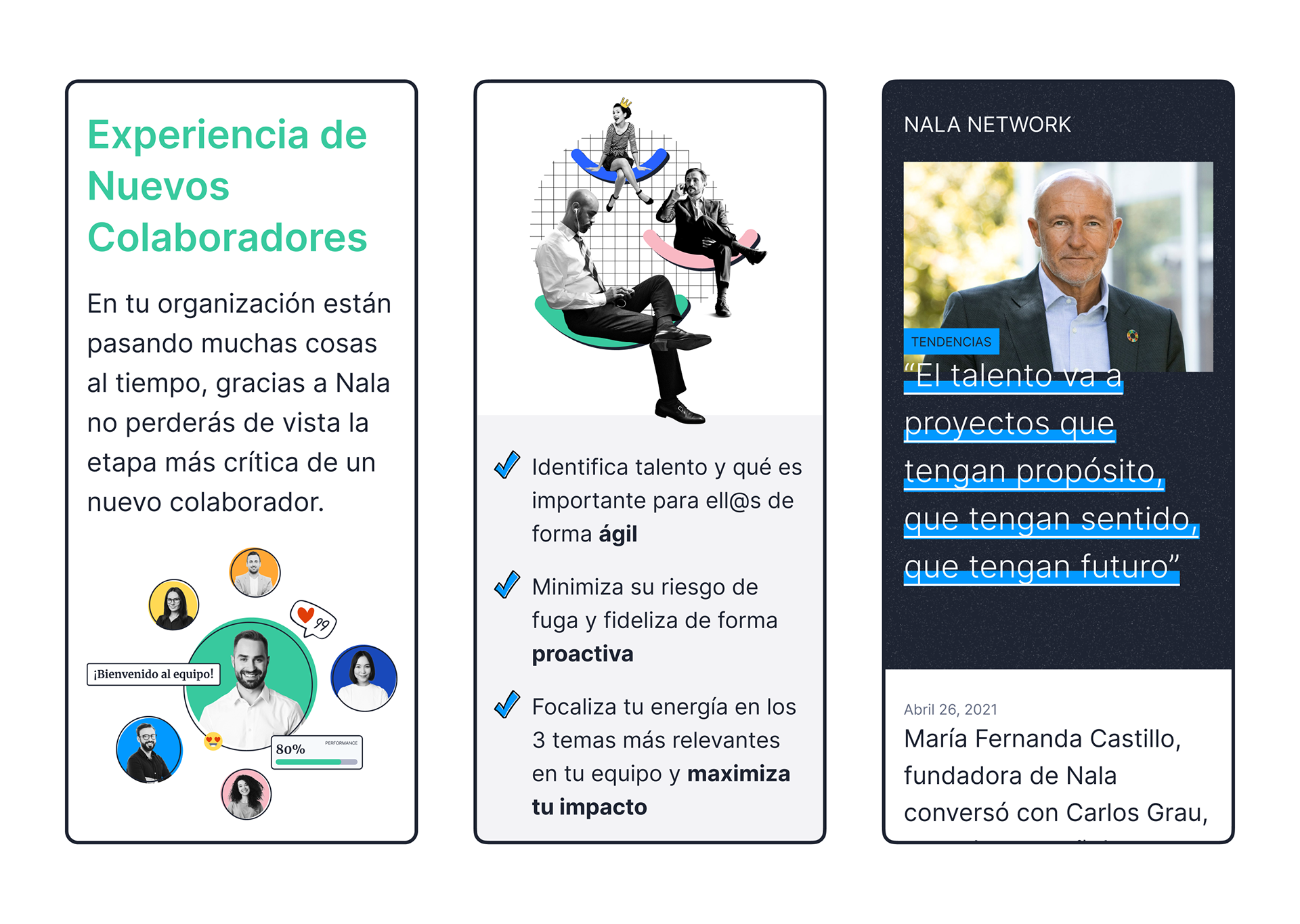
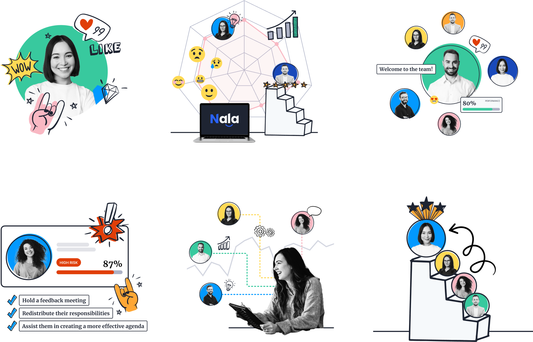
Visual Language
The next phase involved developing a visually captivating language that successfully highlighted the brand's inherent "rock" character. To accomplish this, collages and doodles were employed to infuse the brand with a vibrant essence, portraying qualities such as boldness and innovation.


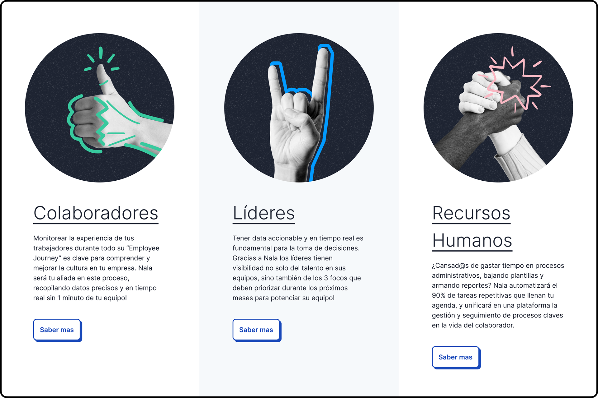
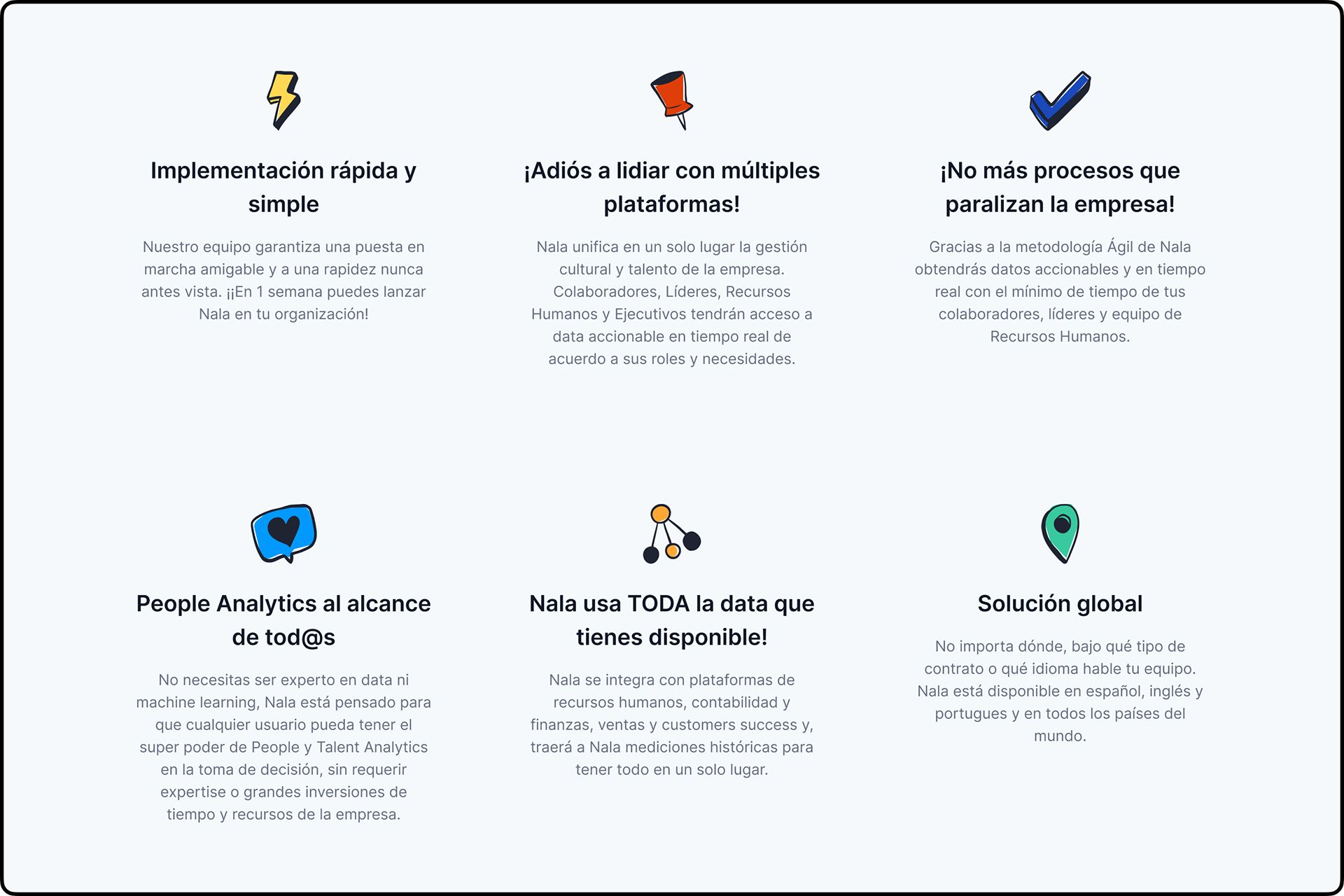
Website
In designing the website, emphasis was placed on storytelling to ensure that visitors are immediately informed about Nala's history and why the company was created, while also understanding the range of benefits it offers. This approach enables visitors to make informed decisions when contacting the company to request a demo, as they have a comprehensive understanding of Nala's background and the value it can bring to them.